This is just a work as a tool. Her point is to extract a few comfortable colors from a well-matched painting and then paint them on paper after blending.
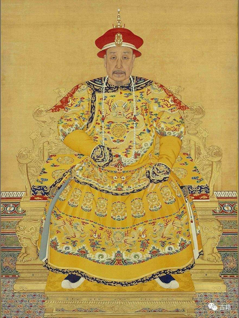
The painting I chose was a portrait of the Qianlong Emperor. I’ve always liked the color palette of ancient Chinese royal paintings. The painting is dominated by various yellow and orange colors, with a high gray scale and a small amount of high-purity red and blue embellished.
After selecting the colors I felt like I couldn’t see the whole “palette” feeling. Because they come out not as a work, not as a whole. So I try to give them a sense of work, so that I can better feel the harmony between colors.
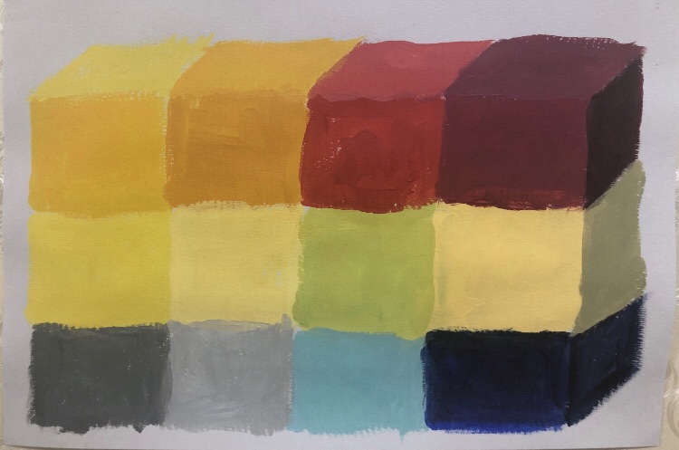
So my “palette” is not a collection of simple color blocks, but a sense of a row of color boxes. After drawing the upper surface and the side surface of the square, I felt the comfort of matching colors better.