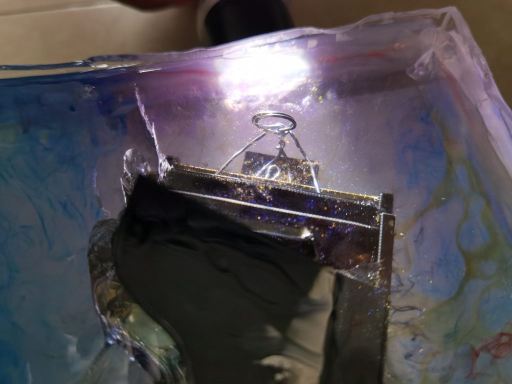
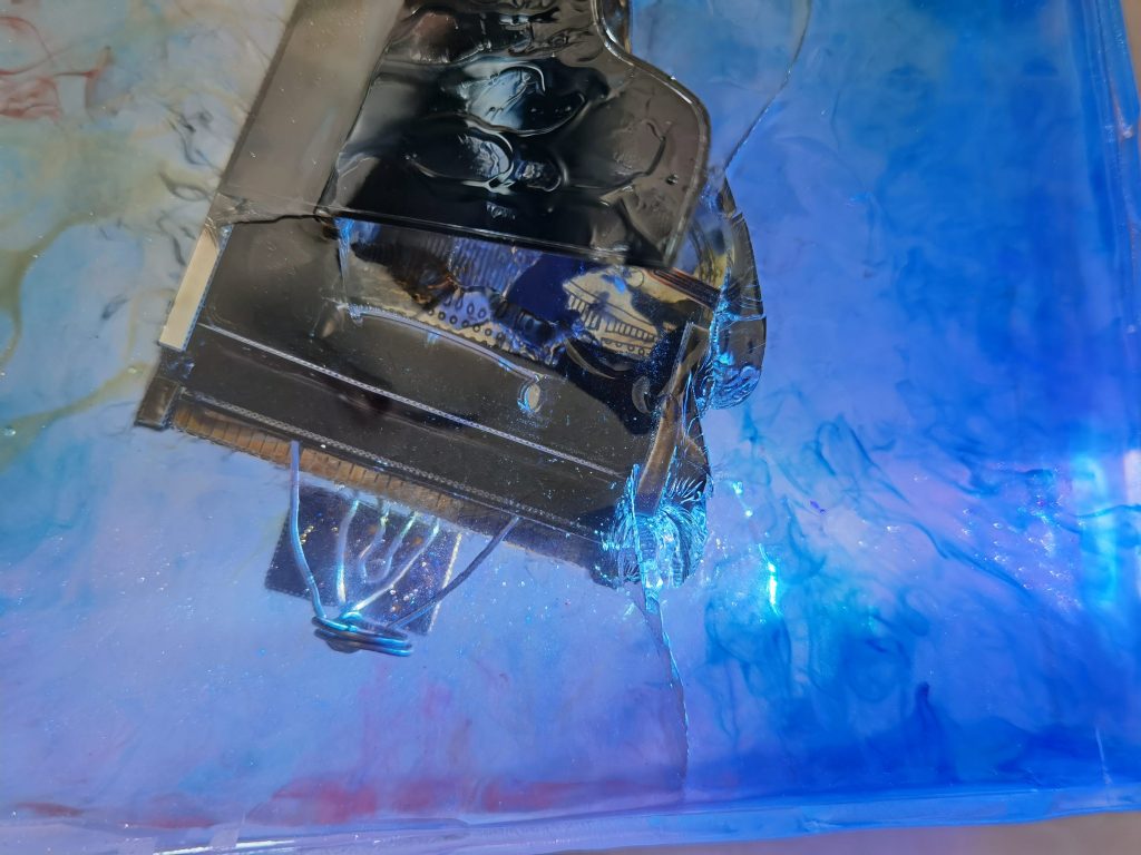
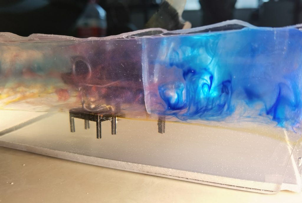
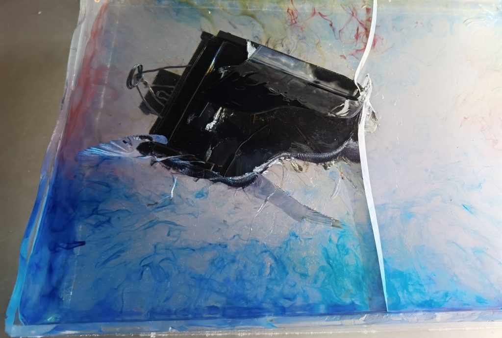
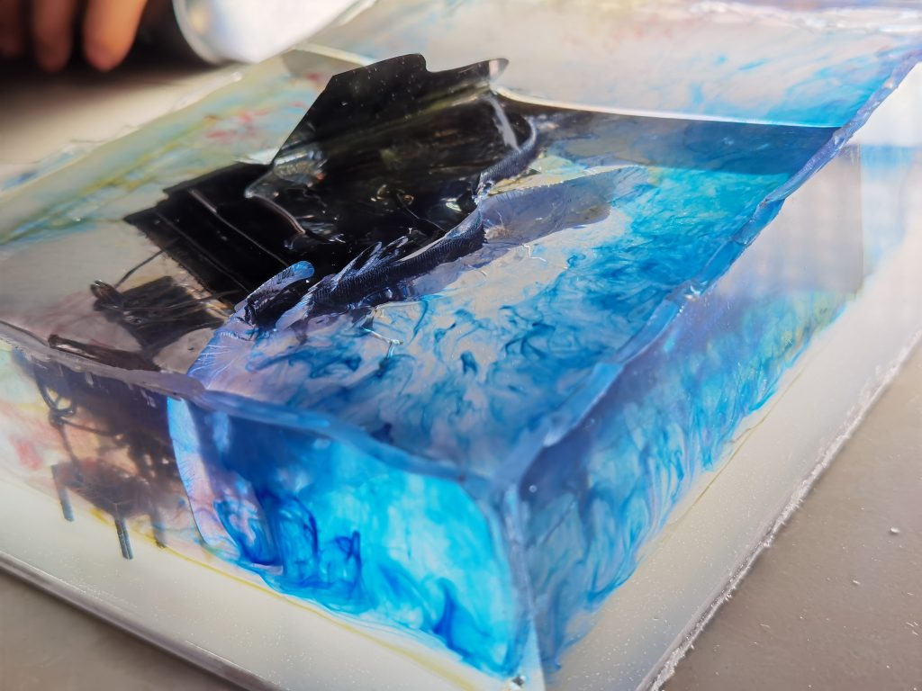
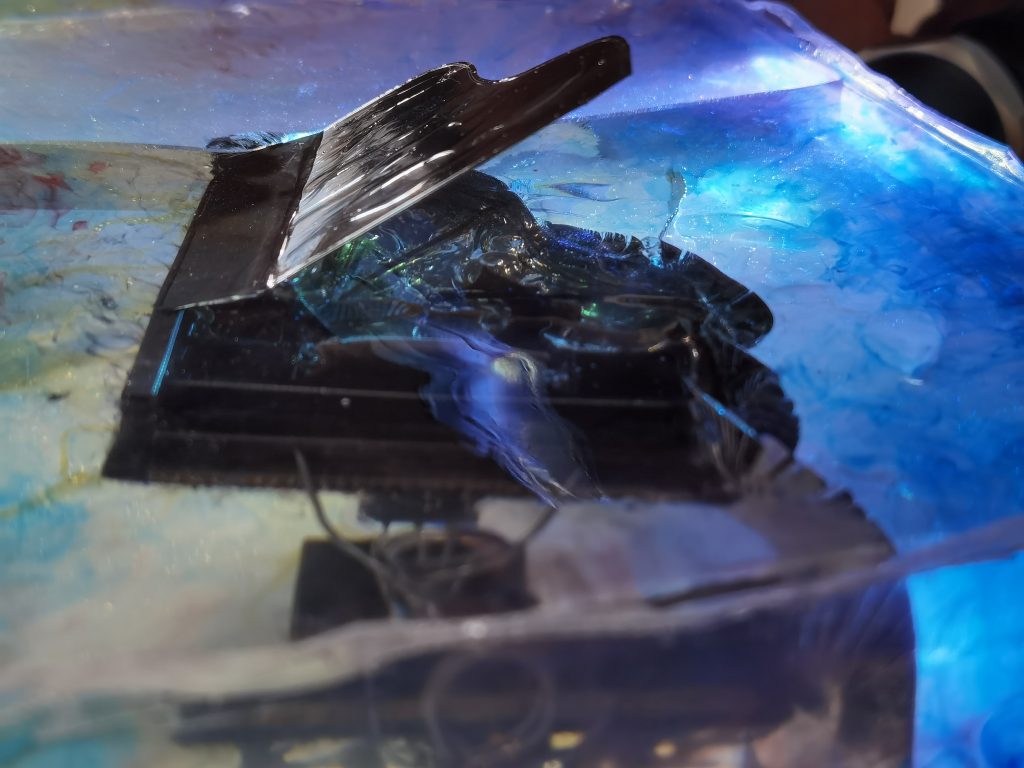
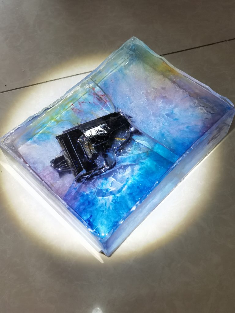
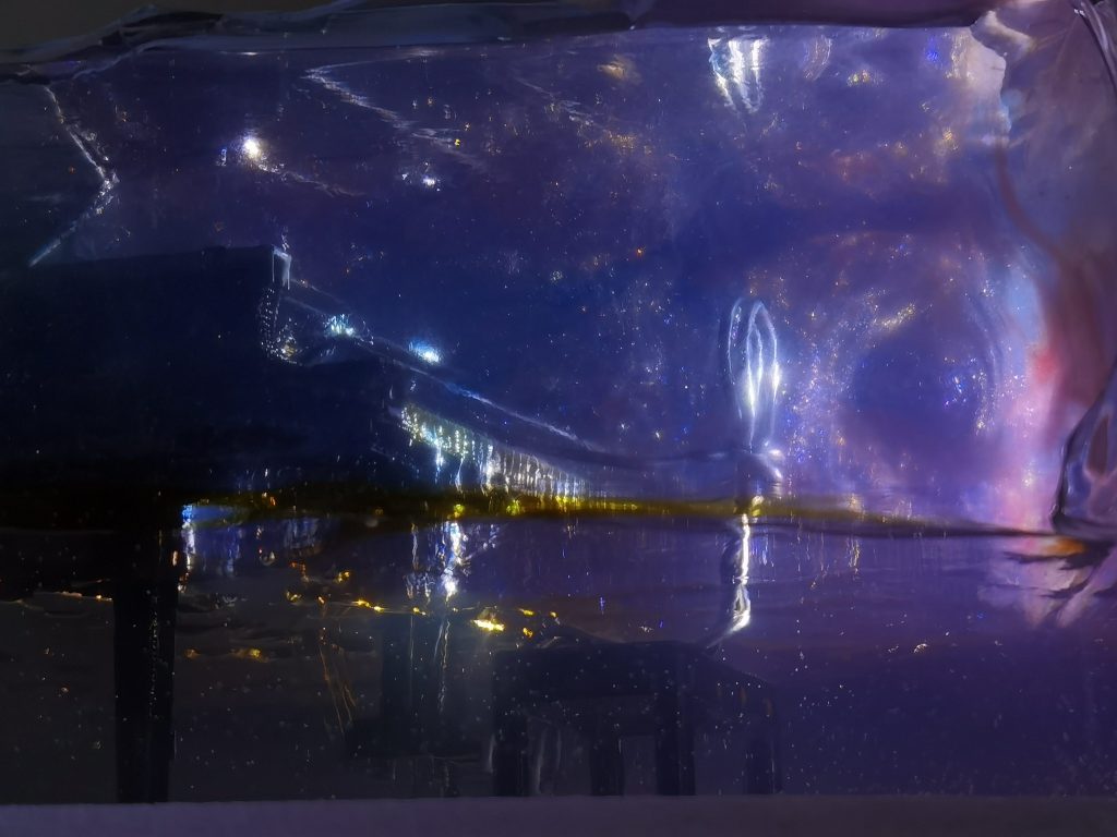
This is the last work for the end of this term. We were asked to think out a topic of our own and can use anything to present it. So the first question I thought about was how can I combine or present the power of sound from the visual impact. That took me a long time to think. But then an idea just came into my mind. Which is to use a material called drop rubber to seal up a piano, and to make some visual impact from using colors. Which the color can be shaped into whatever you like in this drop rubber. With the piano inside, combined with the color. It may seem to be a pretty good idea.
But the process wasn’t as easy as I expected. I think the hardest part is to decide how big it should be and how am I going to stick to it. At first, I didn’t quite calculate out how big it should be. From picking the size of the sideboard to how much drop rubber should I use. Nither of it was well organized. So it left me the problem of the sideboard size was too big and little of the drop rubber that I have.
At last when I’m doing the final part of shaping the color, At first I thought it would be easy for just can use a stick to pick the color like you are swinging it. To some kind of shape like from piano inside radiating to outside. And that was the effect that I want. But, things just don’t always happen in the way that we expected. When I shaping out the forms of the color. Left with satisfaction. When I came to look at it the next day, Despite the color remained some sort of magical shape and the radiating direction was turned to point outside to closing in to inside, the shape of the color that I formed was all gone. Furthermore, there’s a big transverse crack and a few small cracks beside the big crack.
I guess it was all because of the exothermic reaction of the drop rubber.
However, I think this crack just perfectly presents the power of the music. Colors are like absorbing by the piano. The piano is like crushing onto something and show its strength and power. Just like it can crush everything. And was absorbing energy wait for a massive burst.
分类: My art project
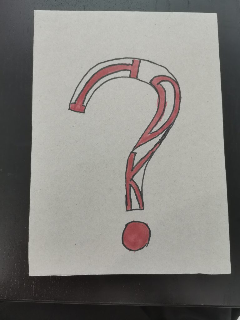
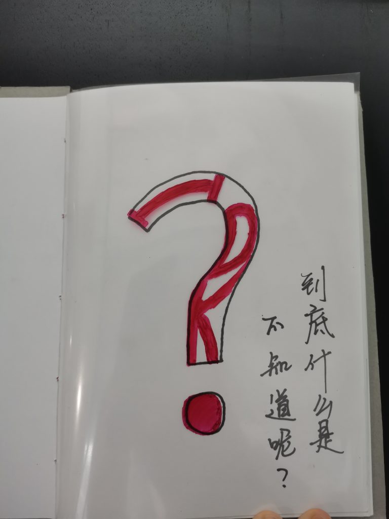
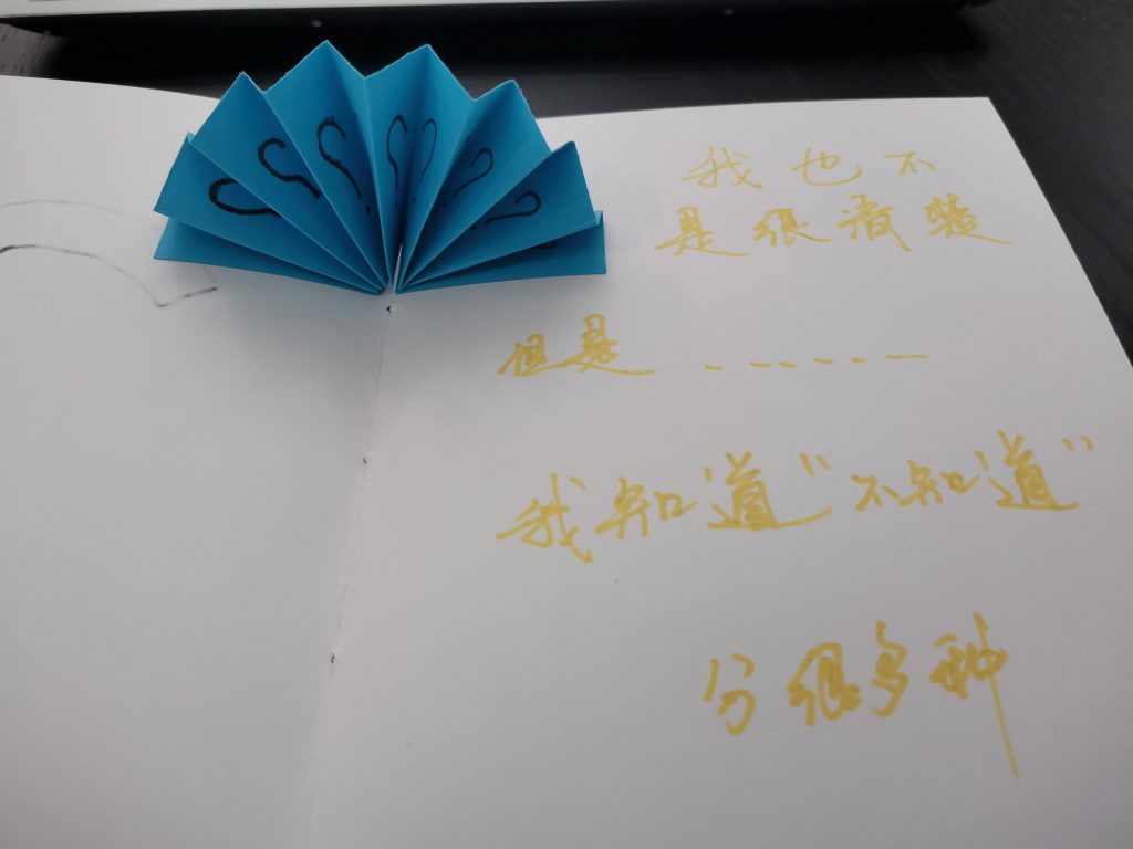
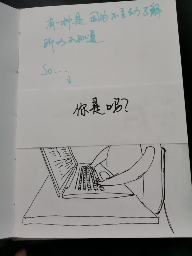
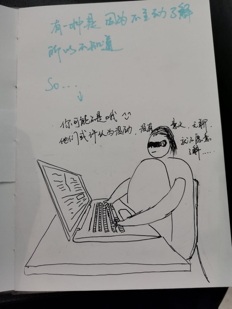
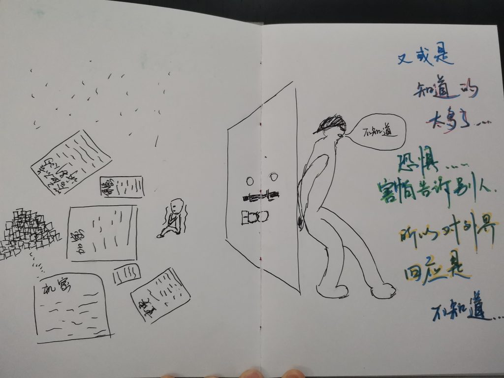
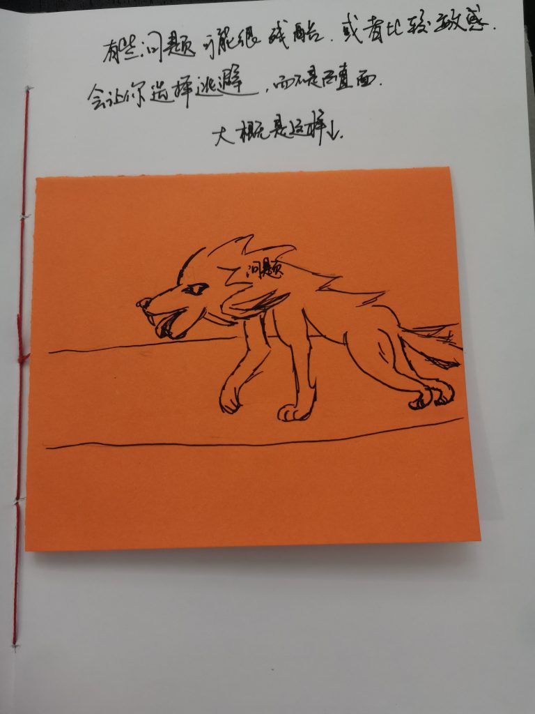
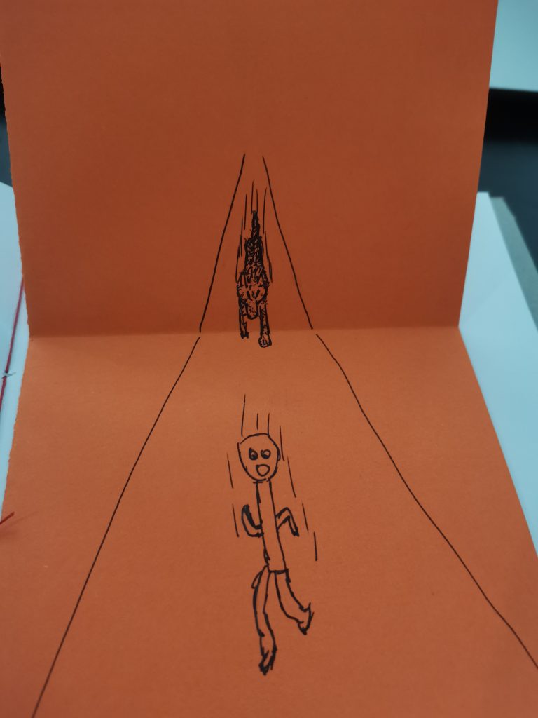
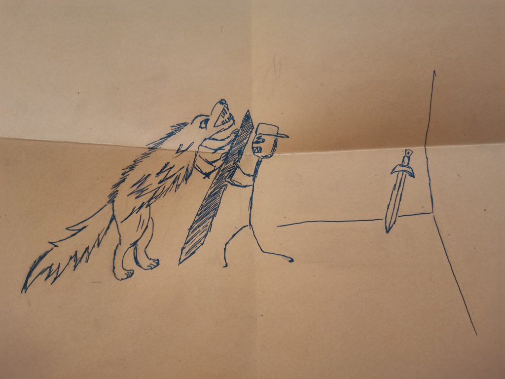
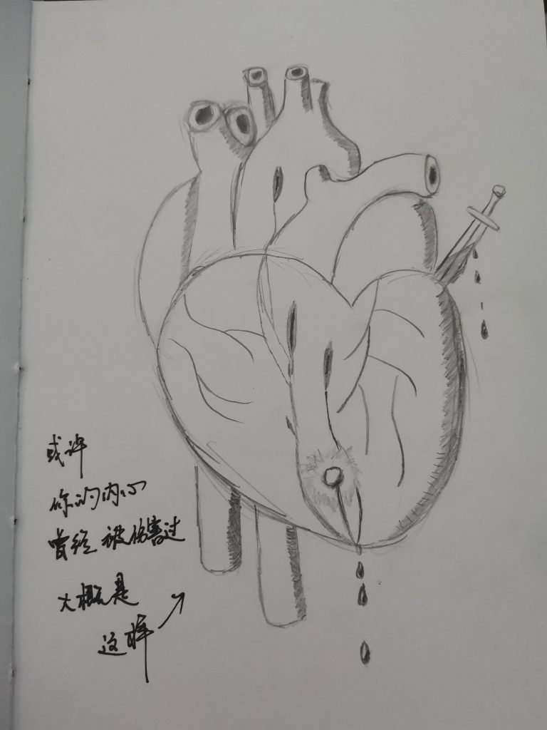
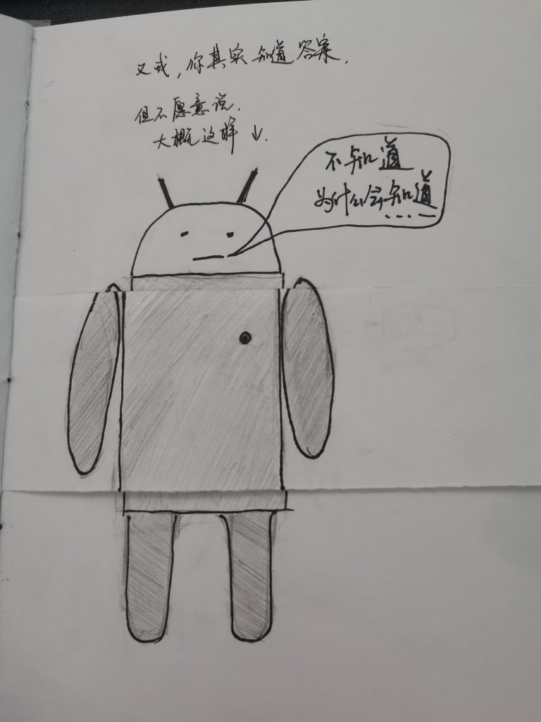
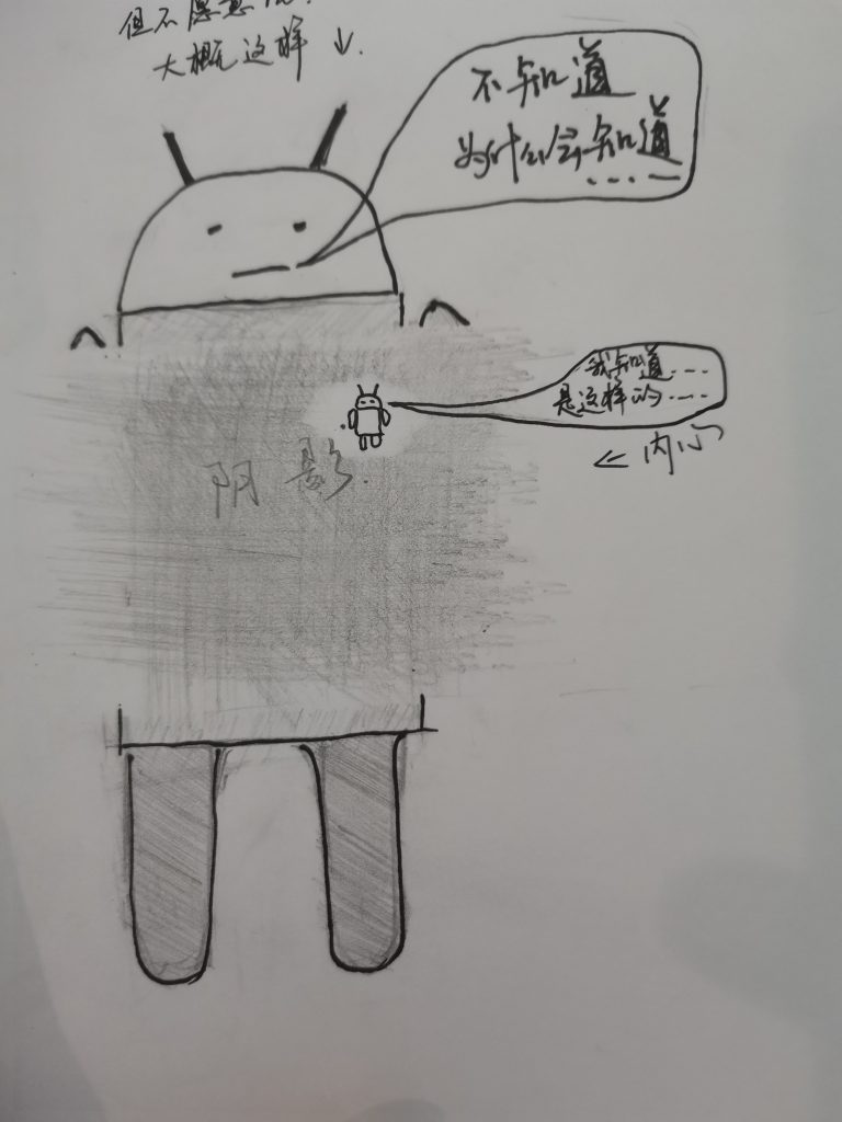
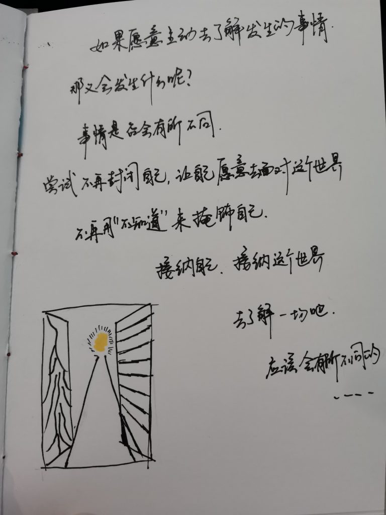
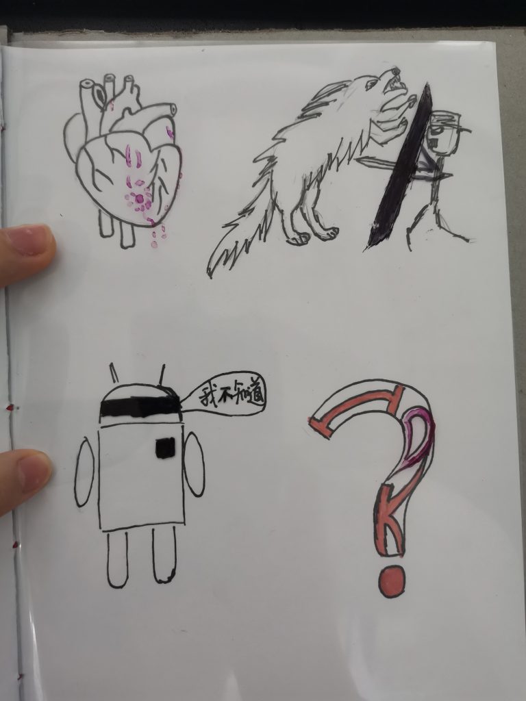
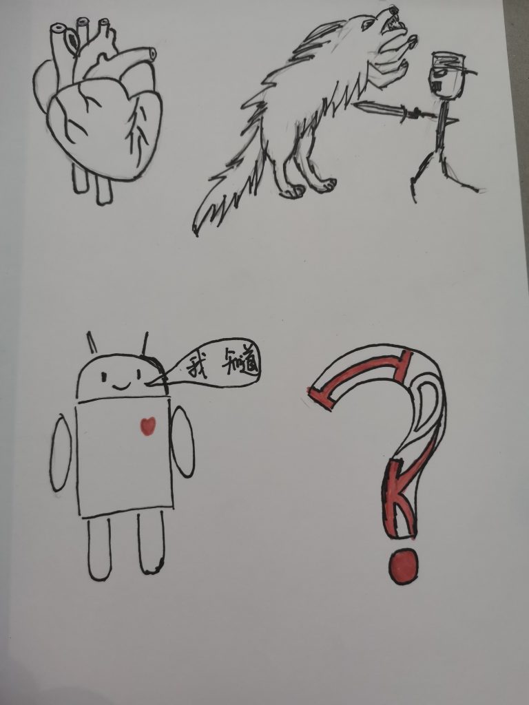
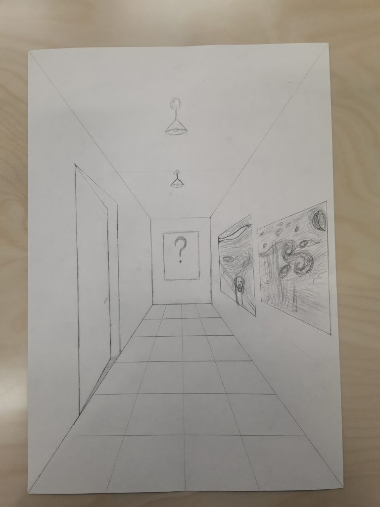
The concept of my book is more like a personal event to me, for a long time I really like to say “I don’t know” to every question that asked me, and once I really want to figure out why, so that’s where this concept is came from.
For several pages there are some special designs in it. And these are pretty effective for me to like ask questions or to show some of my thoughts. Most of the things that shows my concept is the texts and paintings in the book.
The challenge for me is the team work part. Which my partner thinks out this concept, or say that we both found out that people in life they like to say “I don’t know” to every question. So there are plenty of reasons that we might say “I don’t know” to some kind of questions. But the way of presenting it we got some diversion. Whereas I want’s to just show my thinking process while she wants to present it in another expressing way. Then we decided to just work on our own and with this same topic is enough. Turns out, that was a pretty good strategy which we both did pretty well on our work and also our presentation.
Another challenge for me is the content of the painting. At the beginning I was struggling with whether I’m going to both draw it realistically and fully express my idea, or just only present my idea and not to think about the skill is good or not. At the end, I chose to fully express my idea but take less care on the realistic. Then when I made up my mind, I did it faster than be entangled with both give good skill and my idea to my painting.
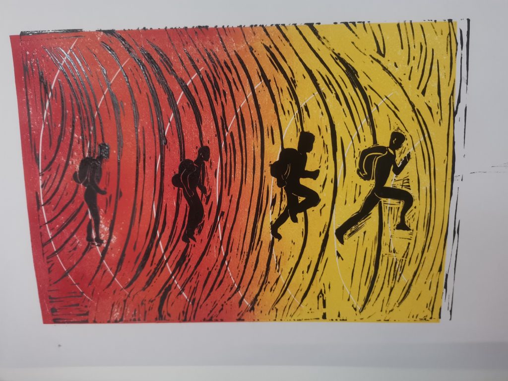
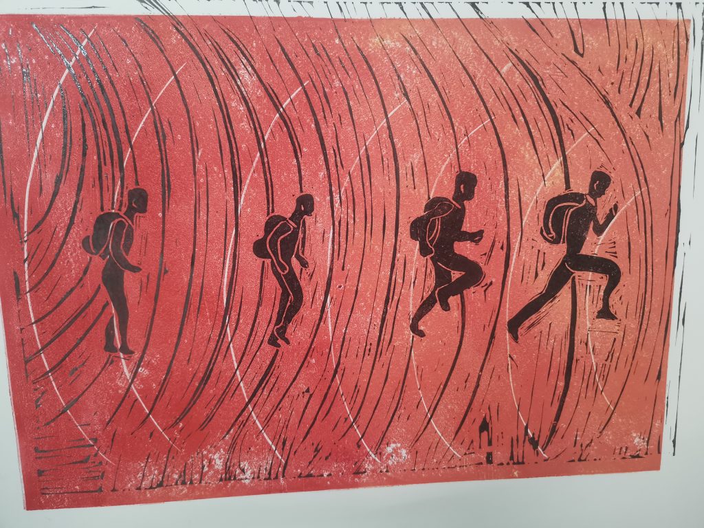
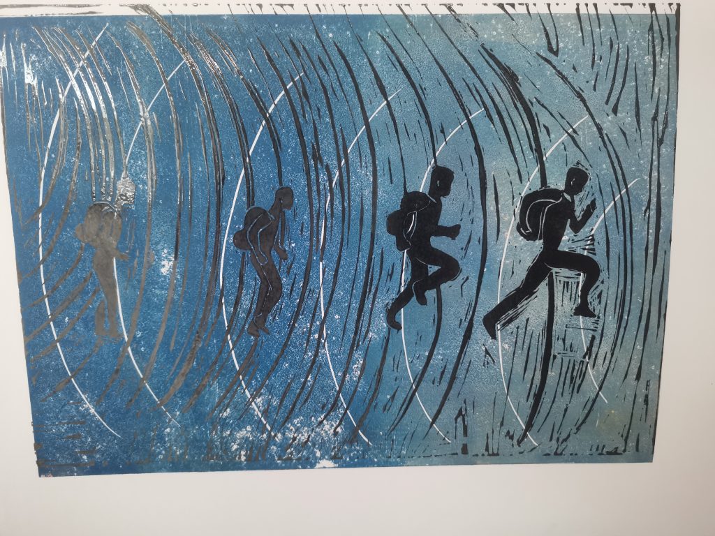
This time we did a Linocut maybe known as board painting. It’s a pretty fun thing to do because this time we need to carving the board in order to make some mark on it. And then when we finished, we brush the color on the borad, aim on the paper and then you can print out the painting.
This time our topic is to describe our daily life. These 4 people from walking to running is like a symbol of the rhythm of my life. Because we need to go faster and faster on our study speed. So that’s the concept of my paint.
I think the first one is my favorite because the color gradient is very obvious which makes the whole paint clearer, and so for these four people they are from bright to dark from left to right. Which make the contrast to the background more obvious.
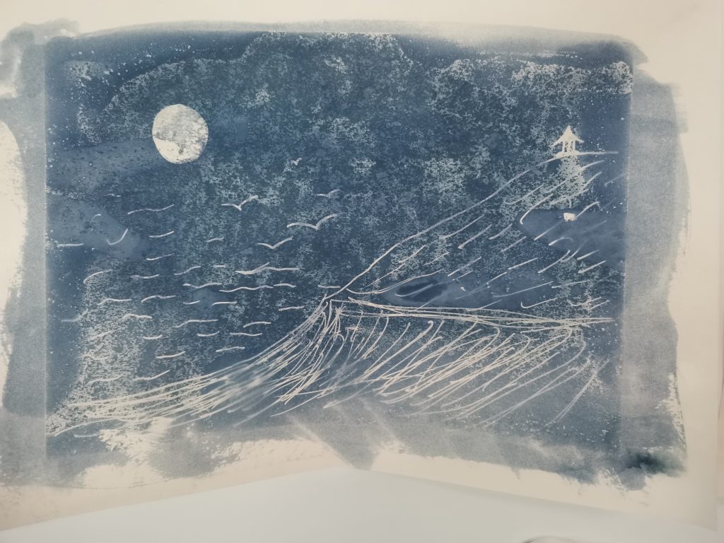
For Cyanotype, well that was just a practice for the Linocut. Purpose is to let us know about when you draw something on it, if you wanna let the main part on color, you need to take everything else covered. The opposite, you need to only cover the main part.
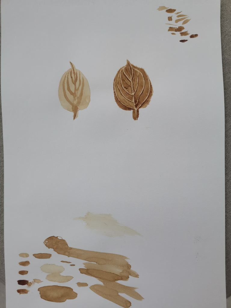
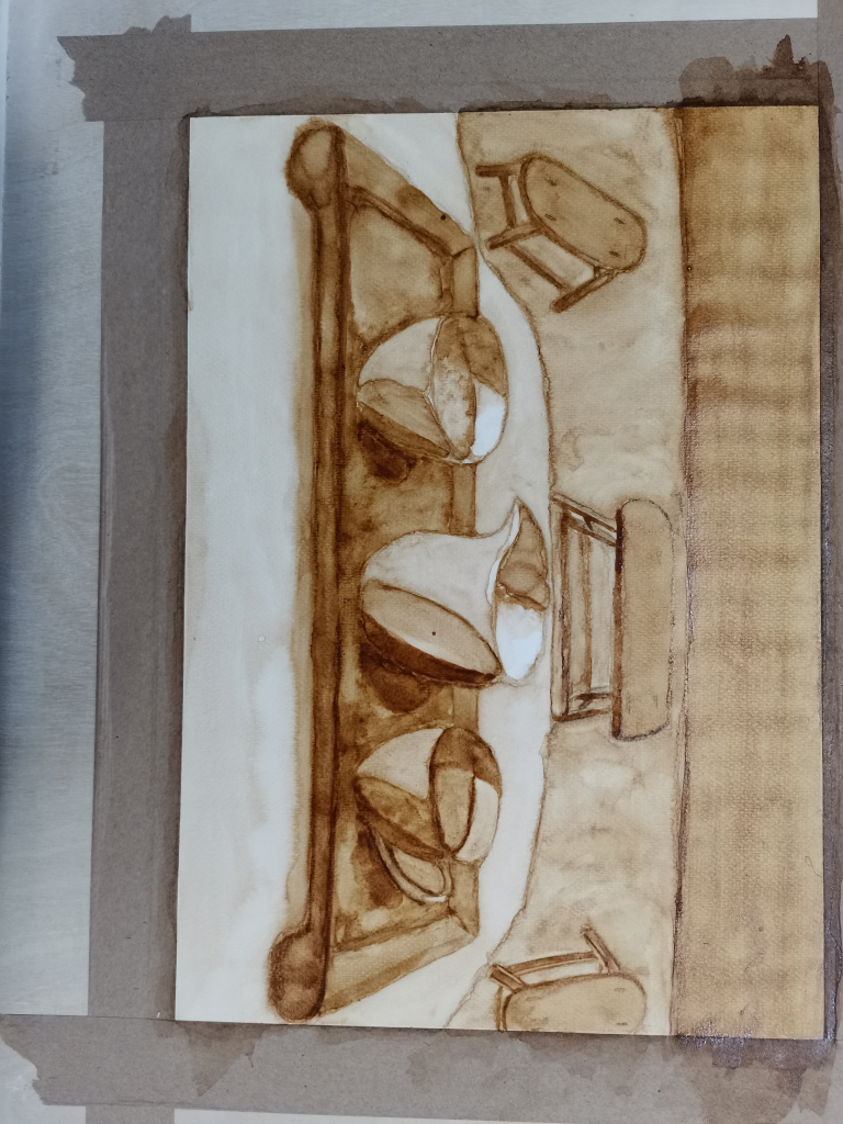
It’s a pretty interesting thing to draw a paint with coffee. Although the smell’s form the coffee are prettey good, the most delighted thing about coffee painting is that I think I finally know how to create the atomsphere. Perspectivity,the realistic lightning shadow effect, the bright side and the gray side and the dark side. I feel like I’d kind of mastered it. The felling this time is quite good.
The way I did it is about paint the color over and over again. To make the bight side feel like is bright and make the dark side feel like it’s dack. And then the administrative levels will be more and more clear to your sight. I see this as a great progress I made than before. I’ll keep on trying to do even better.
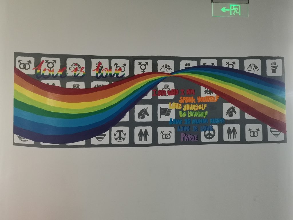
As you can tell our wall painting is mainly about the big rainbow. The big rainbow represents LGBTQ+, and this is our main theme. We want to show the audience that we should accept all kinds of human beings, and let them know that love is love, and everyone deserves it. We should love ourselves, cause if you want to love someone, then you should know how to love yourself first. I believe the rainbow represents a really important thing that “everything is part of a harmonious world.”
Other than the deep meaning being conveyed through this work, we also think that the color of our painting not only represents LGBTQ+. But it also gives the audience some positive energy to the people that walks by this hallway. We wish the bright tone shows the energetic characteristic of our team, when we are painting on the wall.
For me, I’m the one who did most of the work on painting color and fix up the details. Although at the beginning of our work my desine doesn’t satisfay for all three of us, but then they thought out this theme and they were pretty happy about it, so I move a step away and do what I can do to achieve the best results we could, so I volunteer to be do more job on actual painting and let them do their desining, as you can see the results is pretty good right?
During our work, I think the most diffcult thing is to get rid of my obsessive in totaly perfection. But with the help of my teacher, I started to look more at the whole picture instead of small piece of detail, and it turns out, not so bad.
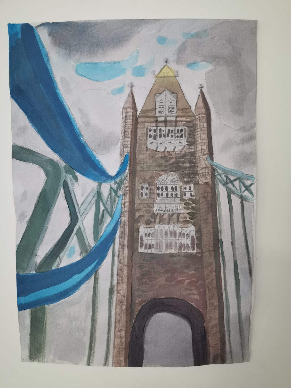
I choose this city because I’ve went there for a school trip, and I really love that place. It’s the irst time that I really see tower bridge with my own eyes. I look it that way when I am walking across the bridge. Thought that point of view is pretty beautiful and can show the bridge is grand and magnificent. And I like it that way.
I think this time I really know where colors are came from. And the what’s the right moment or an opportune moment to add colors on color. It’s really fun to do gouache. There are some part that I didn’t done really well this time, some of the perspective part and coloring part, I think I will do better next time.
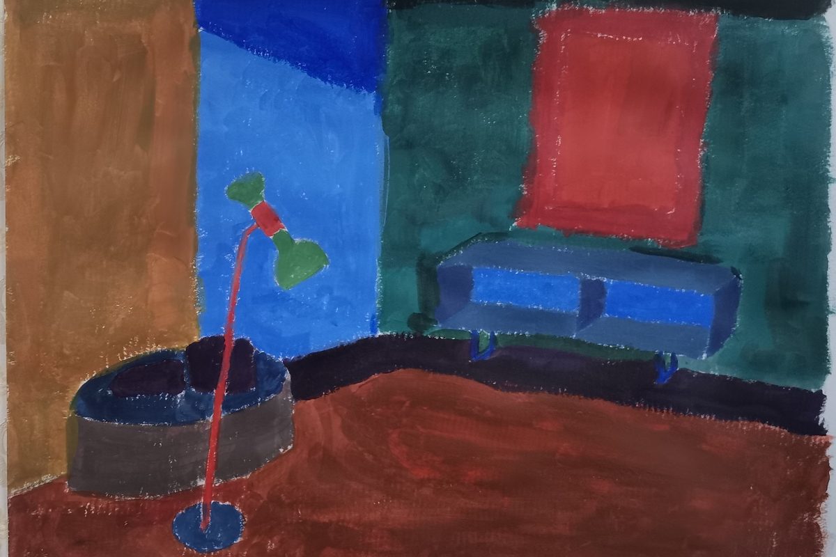
This section is about using the masterpice’s color to put in a room. I chose The Starry Night and select colors from it because I really like this paint and the whole picture of blue also fit my emotion recently.The lesson is letting us to get to know how different color become different color, how can we just use three color: red yellow blue, to create mutiple colors. What is the complementary color, what is similar color. Like red complementary green, blue complementary orange, yellow complementary purple. Sometimes you don’t have to wash your brush to change another color and can just do it by mix different color togther. At the beginning, I know nothing about how to just use the three primary colors to mix to different colors. But after few times try, I am getting more and more enjoyable on doing this and more practised in mixing color. This room shows a madness or a abnormal atmosphere because I think these colors are not very fit to each other. No one would ever decorate their room like this. Although this paint isn’t very good looking, but I did my best on it, next time if I have more time maby I can spend more time on details.
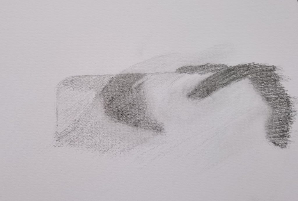
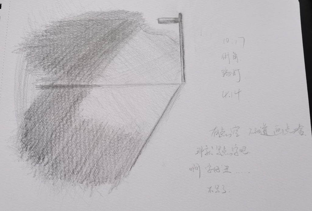
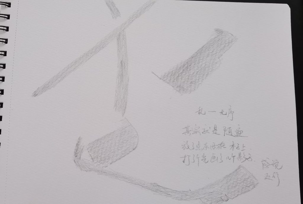
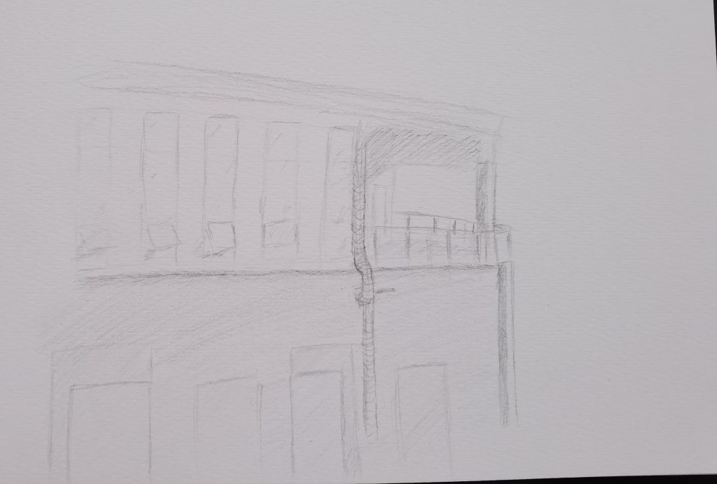
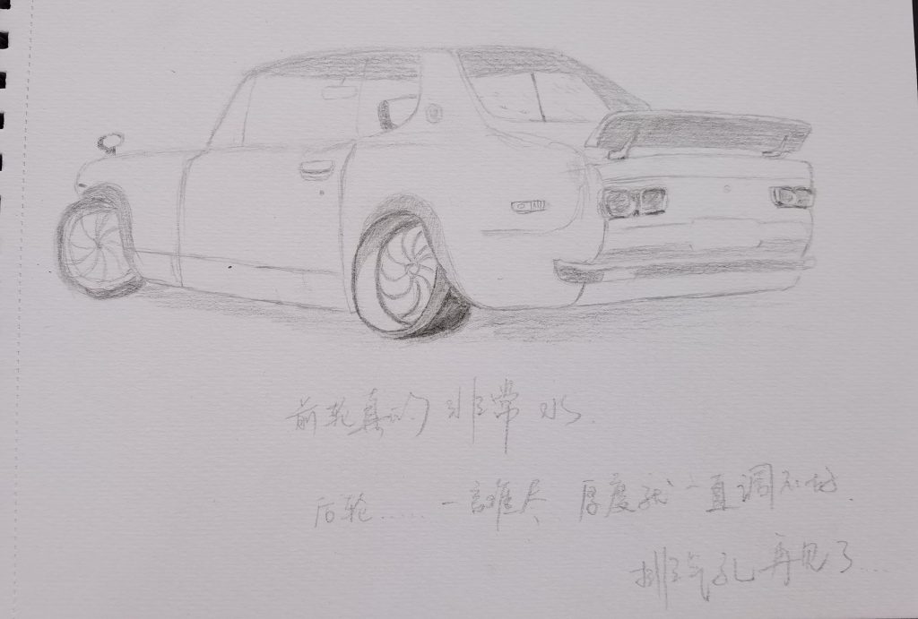
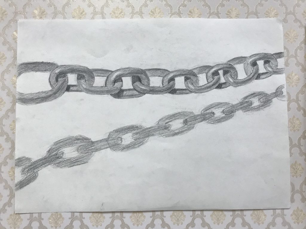
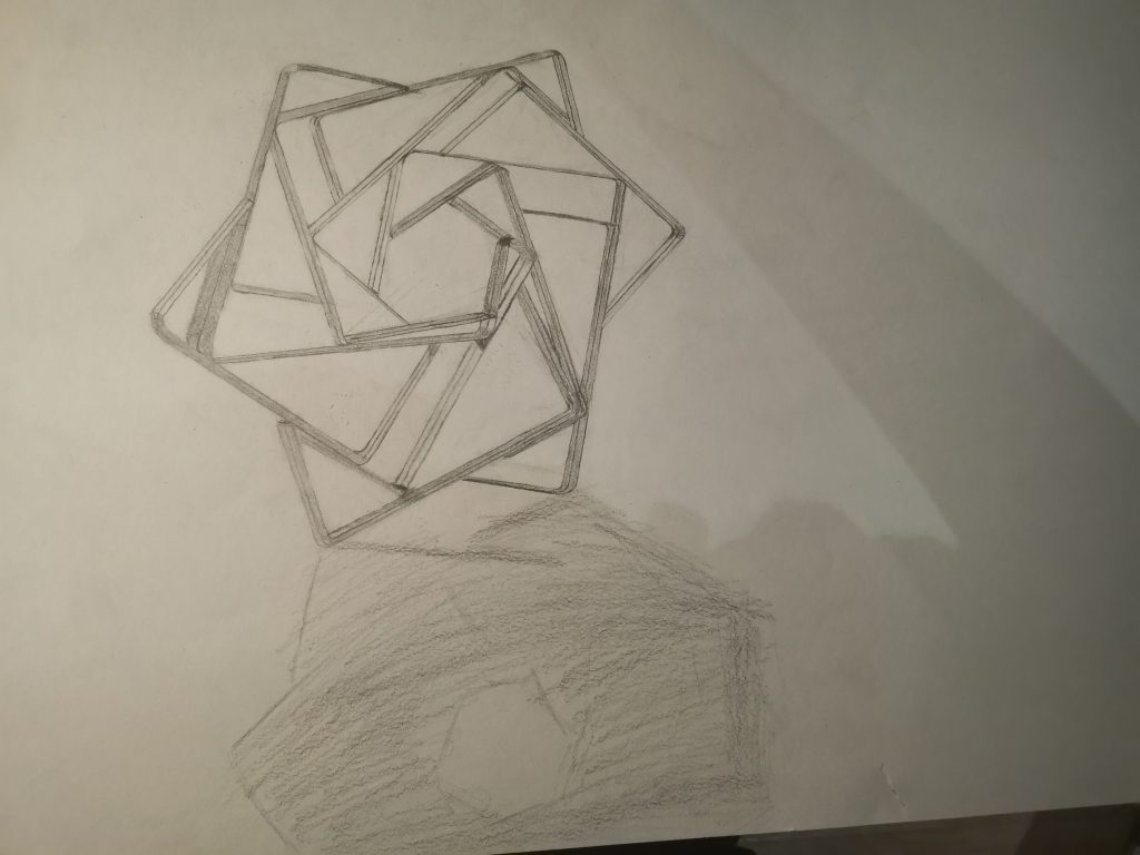
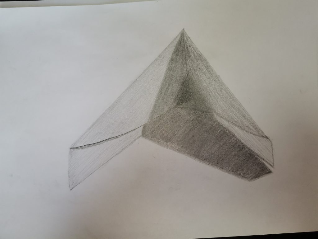
These two sketching is about use shadow to create atomshpere. As you can see there’s a iron chain and an interesting shape that made out of stamples.
I don’t think I did a great job this time because this time I took a long time on the detele and ignored the whole sketching. So that makes me a little slow on the first one. And the second one isn’t very perfect to because some of the part is still not harmonize. Mean time, which I don’t have much time to finish this sketch, so the shadow was ment to be nice and now it is awful. On the other hand, I don’t think both of the sketch did much on atmosphere contrast. So these are what I wish and do my best to improve during next time sketching.
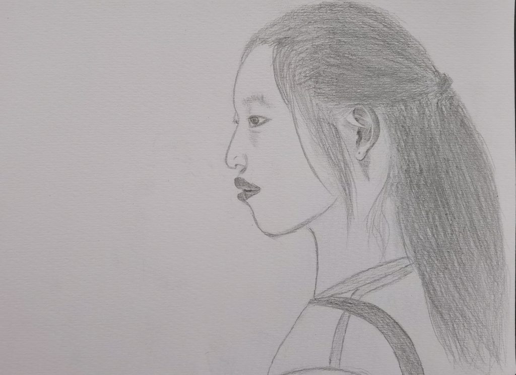
I think I’ve learn that there’s no need to do much on the detele when you are drafting. Just find a few places that can posit the object and then start with some detele. And spend too much time on one exact part of detele. Sometime it will do a lot better if just move on do sth. else and later get back to finish this part of the detele.