Infographic is a visual representation of information or data, e.g. as a chart or diagram.

The data we have is the Youtube data in 2014 about view, like, dislike, comment and so on of the top 100 view. When we first select this data, we want to discover the ratio of likes, dislikes, view, comments between different categories. Which were Sports, Entertainment, News&Politics, People%Blogs, Music, Nonprofit&Activism and Comedy.
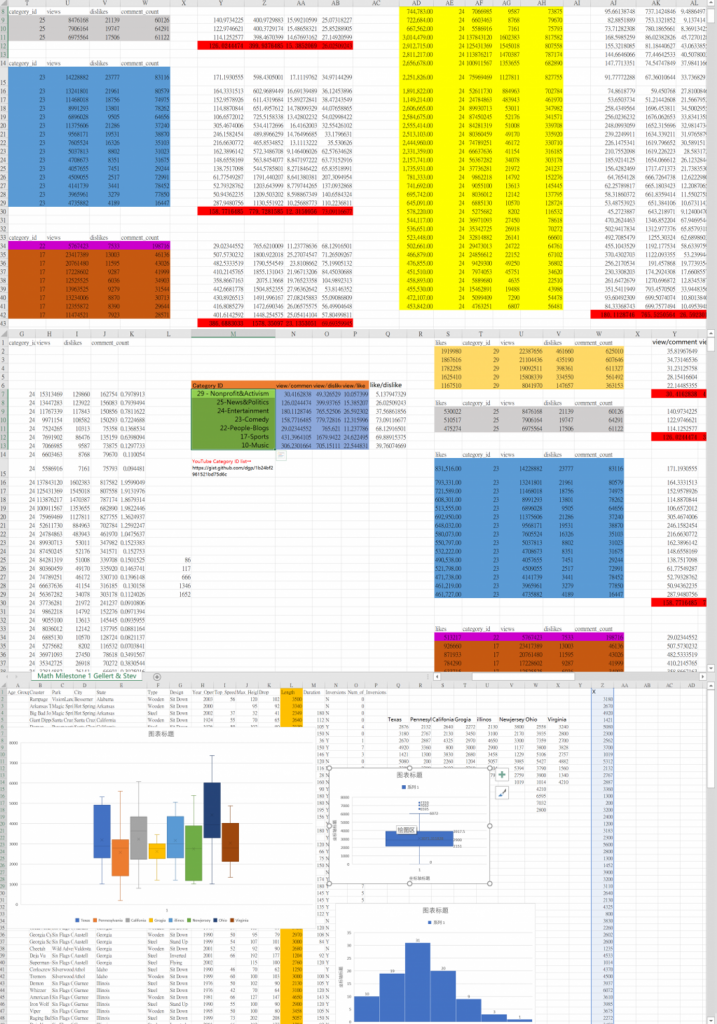
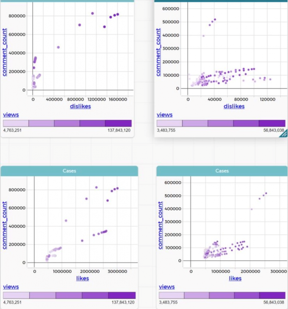
After several times of trying, we’ve figure out all the slope of comparison, but we found out that we can’t compare all the slope in one graph. First it will be too many which means lots of miss. Secondly, it is is so hard to put all slope together.
And then, we got an idea. Which is to statistic the specific value of like/dislike/comment base on view. So, separate the seven categories to take the average of like, dislike, comment and view in every categories and compare them use like/dislike/comment to divide view. That was only three groups of data, so we suppose that the people who gave bad response(dislike) will more likely to leave reply. So we use dislike divide comment to be the fourth group of data so that we can make a circle use histogram.
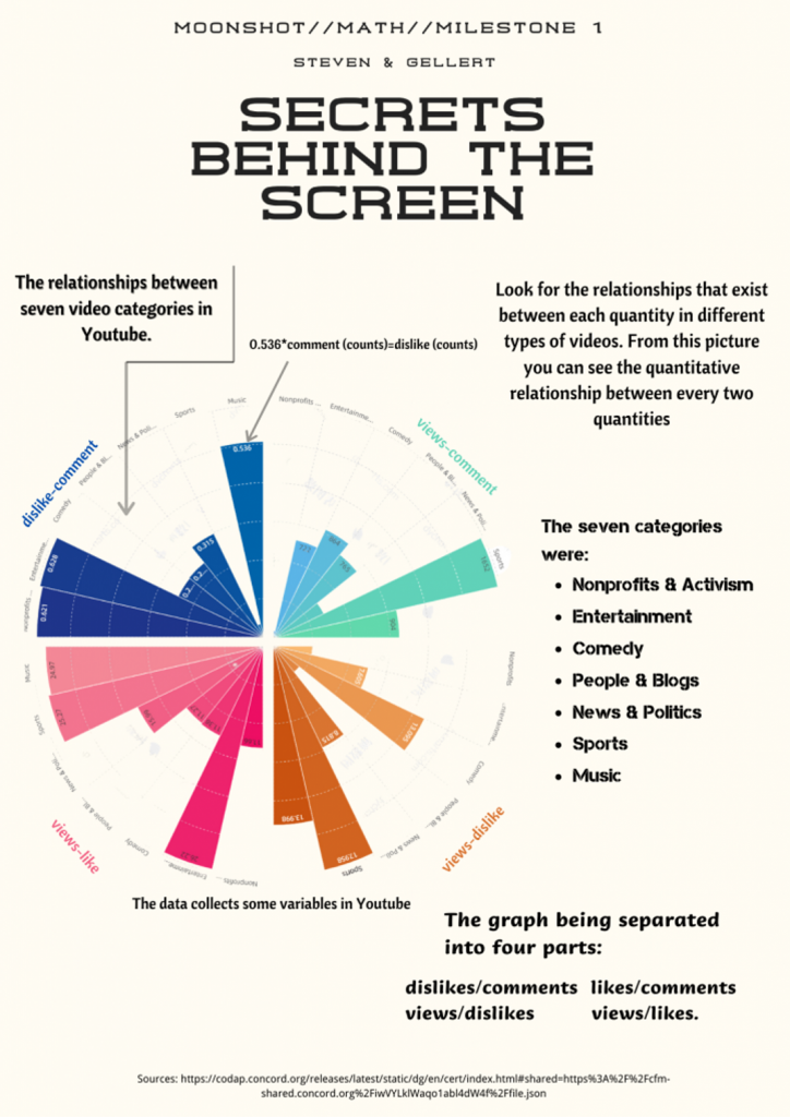
In the infographic, we have the specific value of like, dislike and comment divided view. Which can represent how much like/dislike/comment each view will contain. In the current view, this infographic have many mistakes. For example, this version only interpret what this graph is about, without our discoveries of the relationships between all the data.
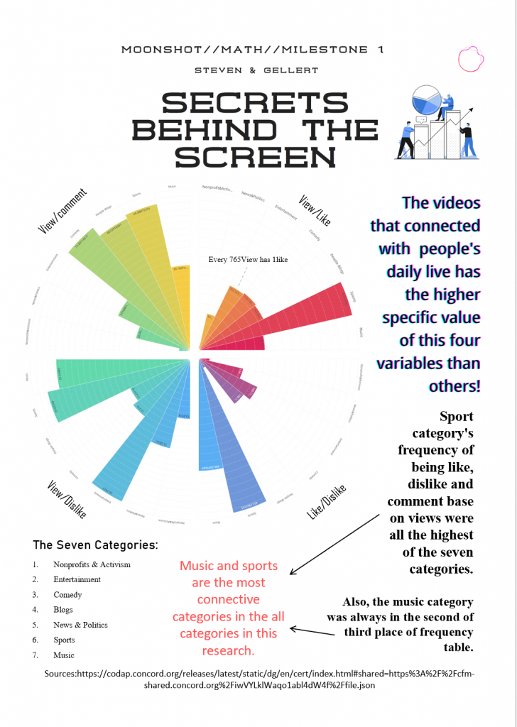
In this infograhic, we have wrote our discoveries. Which is that the videos that was connected with people have the higher frequency of been response. But we very soon we’ve notice that frequency is not a good words that should be used here. Not only that, we found that there were too many unnecessary explanations. Also it is obvious that the relations between the three groups of data and dislike divide comment is not really strong, and our notations of words is not clear.
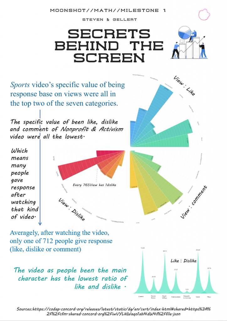
In this version, we’ve changed the biggest things in the graph, which is that we use view divide the other variables, so it is more clear to see how many view would have one like/dislike/comment. The main reason is that, the number of view is bigger than all other variables, so it is more suitable to be the denominator.
We also replace dislike divide comment to like divide dislike for each Categories. Not only that, we’ve organized the main point(our discoveries)into three main point, which was separate by three different colors. I think this make our point more clear and readable, to make the graph more look more harmony, I make the histogram three-fourths circle into gradient.
But there is another question comes up, which is that the identification of categories near the histogram was too small to read. Also, the discovers that we raise only says the high and low specific value, but not separate the good and bad of it. And there is no connection between the three-fourths histogram circle and the histogram below, we need to build connections between it, that the it won’t be too abrupt.